New logo for CMC
For a number of years I have helped CMC Denmark with their website and other graphic work. When they changed the organization so that the association based on the CMC network wanted to open up other consultants, they needed a logo for their new name.
Their name is now Connecting Management Consultants and will still be CMC in daily speech, but because you can now be a member without being CMC-certified, it was necessary to create a clear separation between the international network CMC and CMC as an association in Denmark.
I was asked to come up with ideas for a new logo that could focus on the new goal - connecting consultants - and through dialogue and development we came to the circular round C with two arrows as a symbol of creating connection and networking.
The logo is in two colors - a light and a dark color, where the main message of connecting the members is dark blue. In negative, the first C is white, while the rest is in a gray tone.
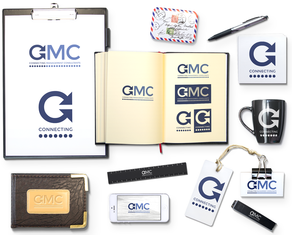
The design gives a natural variant in the form of C with the word Connecting under as an independent graphic element.
See the logo and variants below. Products with logo are not things that are made for the association, but only a visual image of different possibilities.


